‘Living Bright’

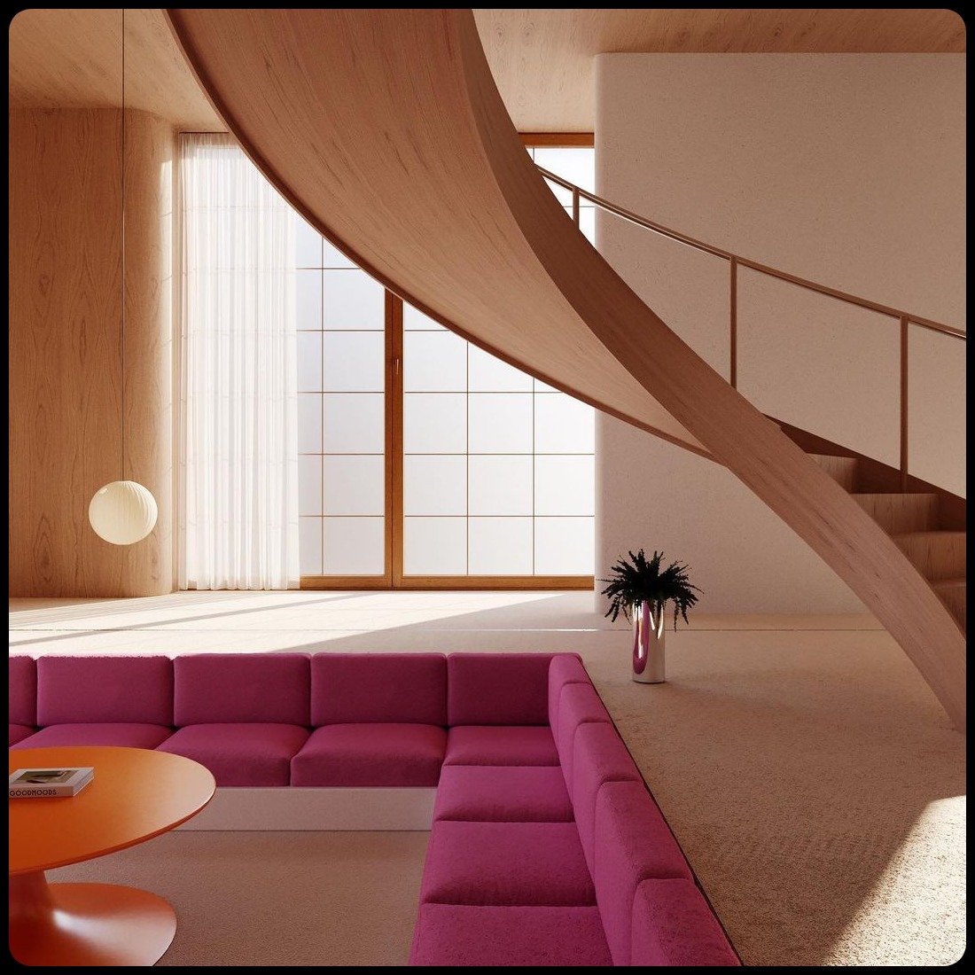
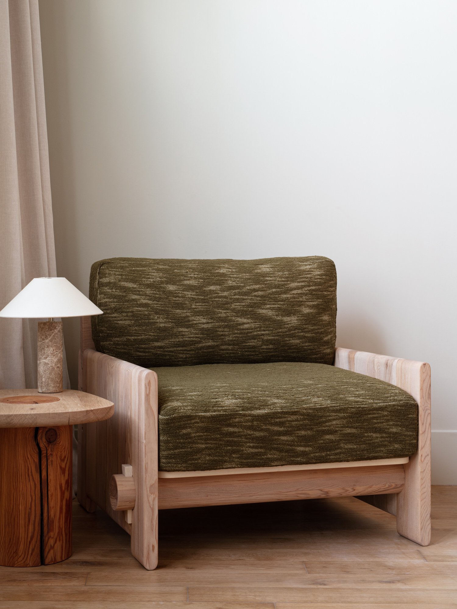
AN ODE TO MATTHEW WILLIAMSON

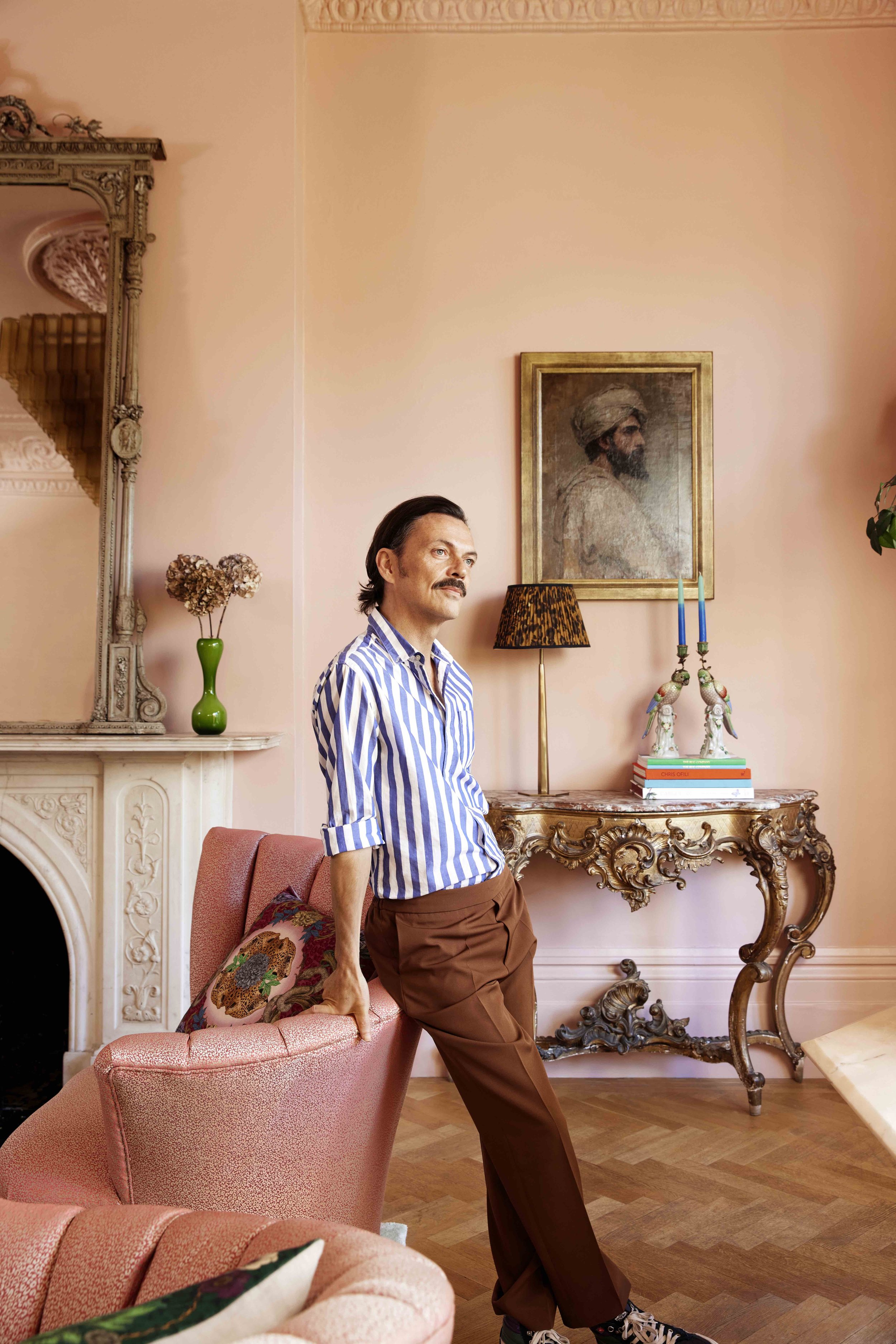
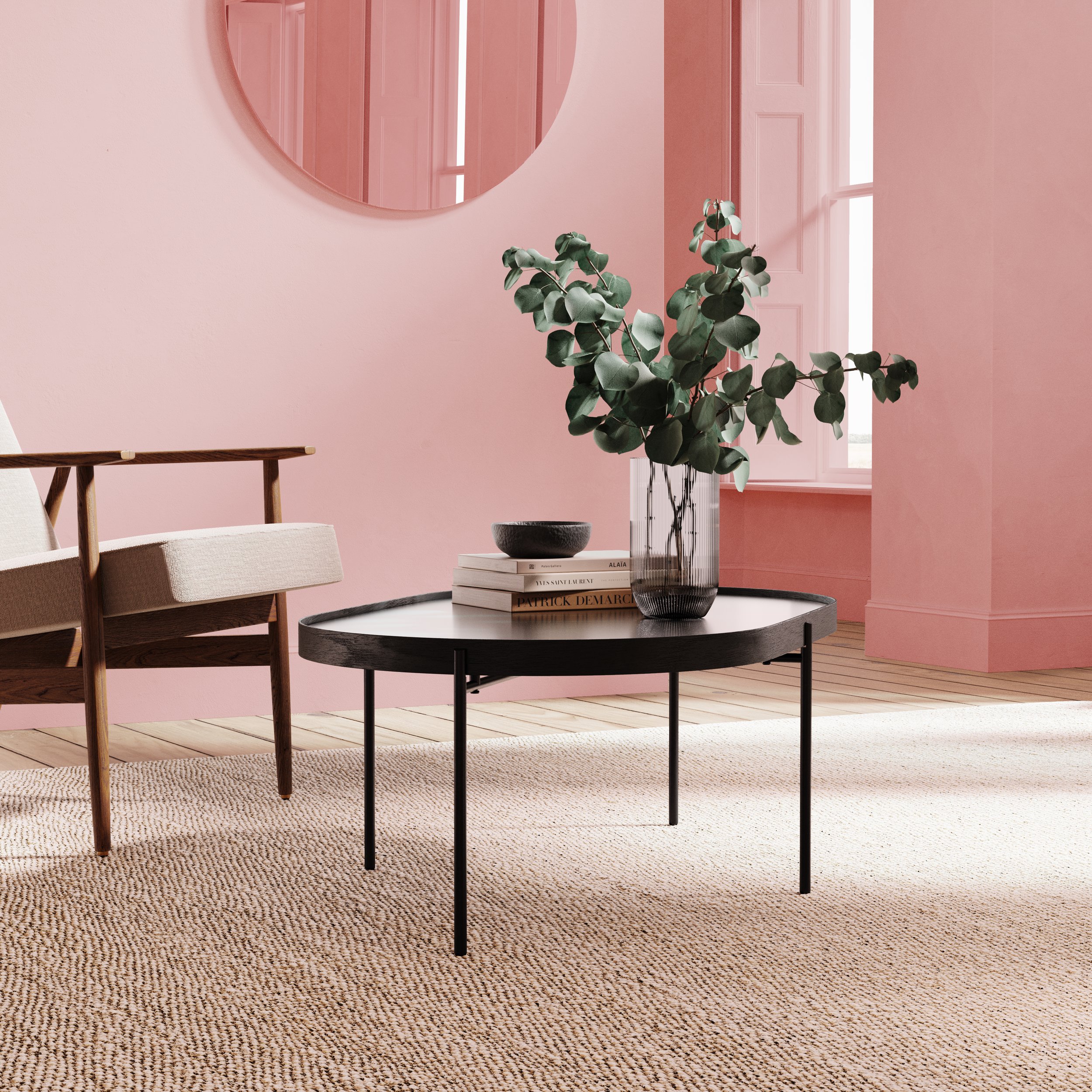
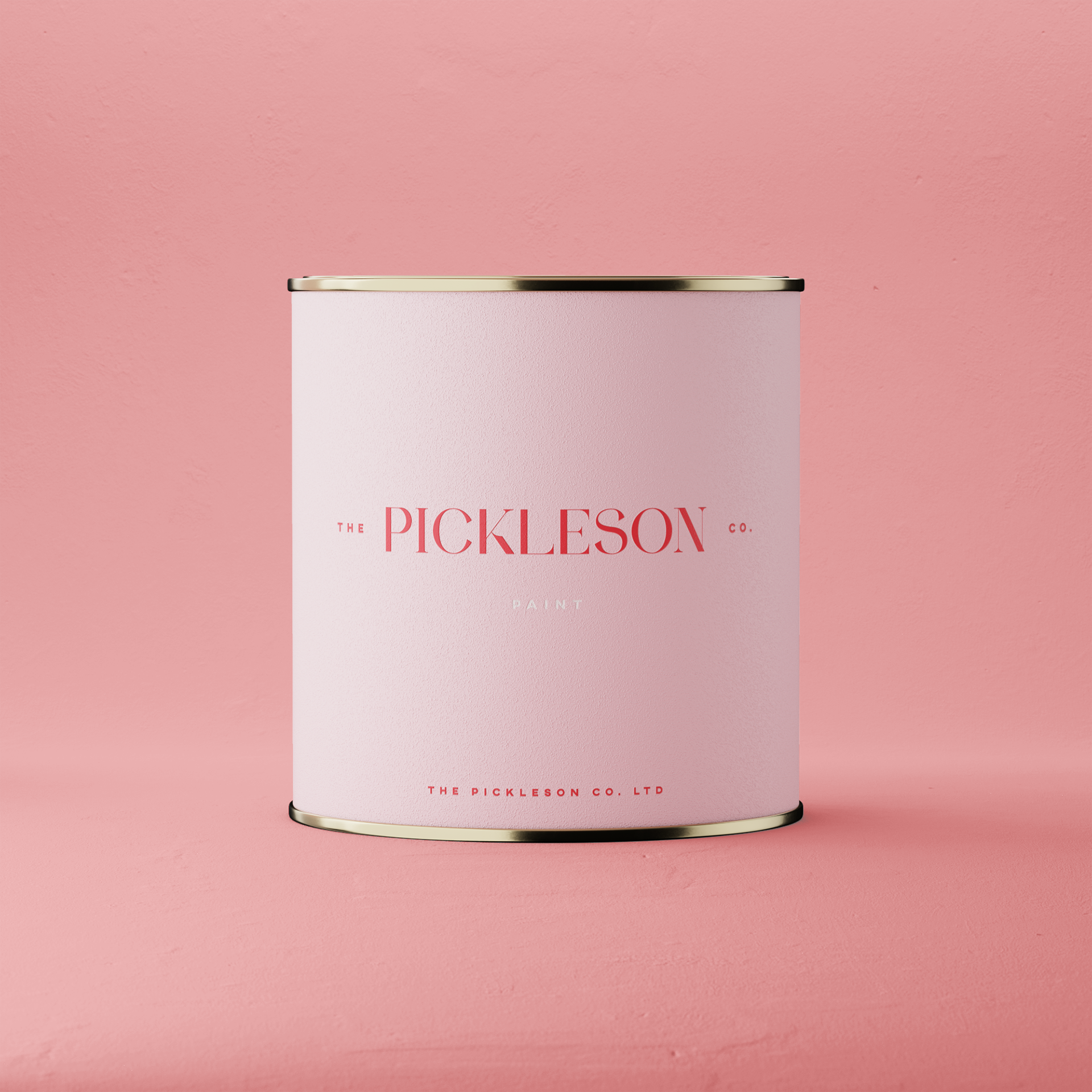
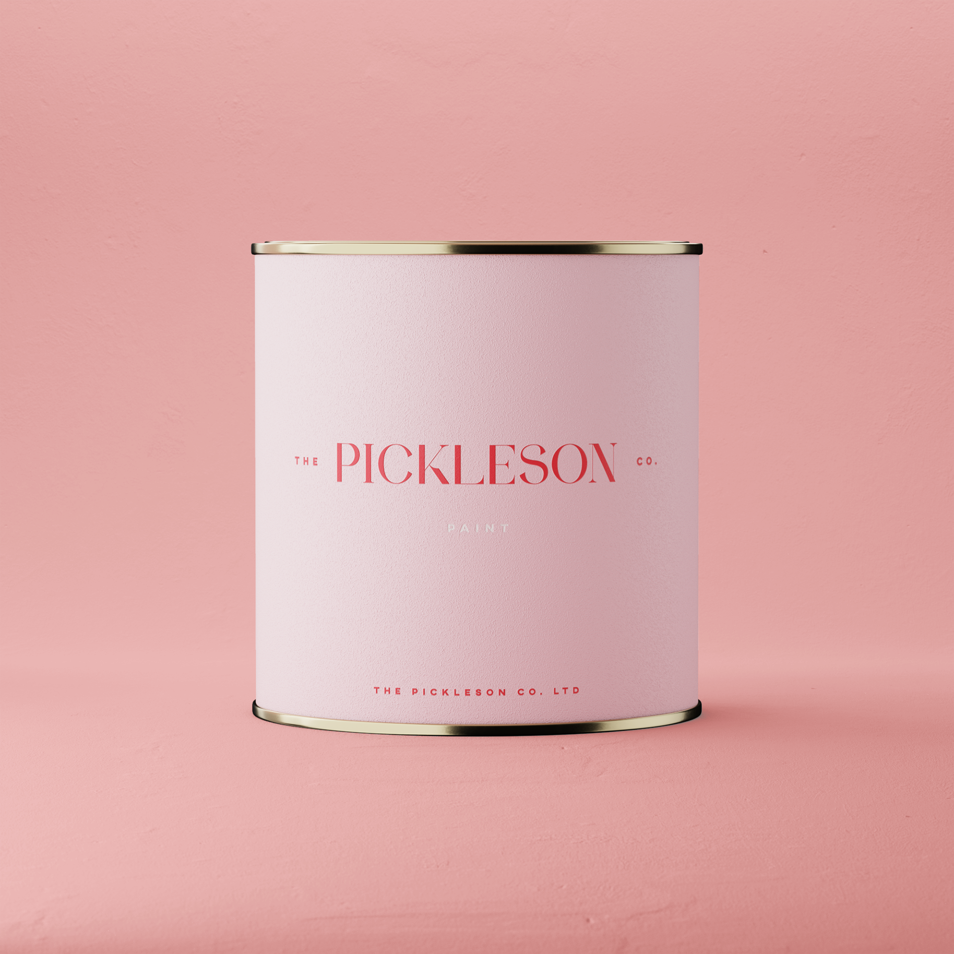
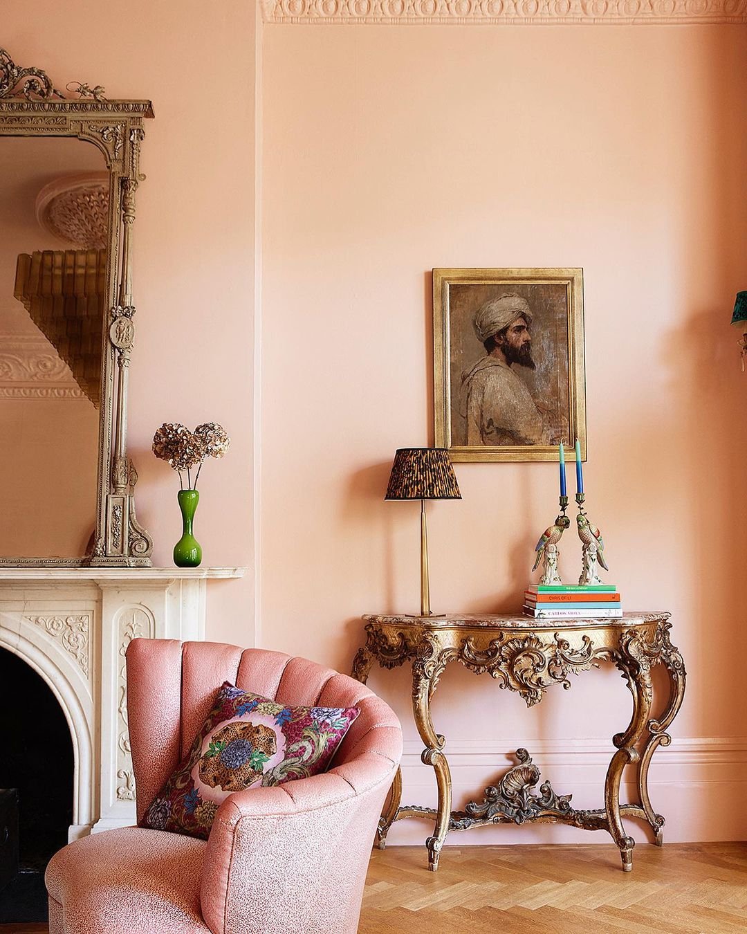
Paint: Lido Pink by The Pickleson Paint Co. | Model: Matthew Williamson | Photography : Sophia Spring


after a week spent sipping sangria…

…On the north-coast of Mallorca, we arrived home to a copy of Matthew Williamson’s new book ‘Living Bright’ perched on our doorstep.

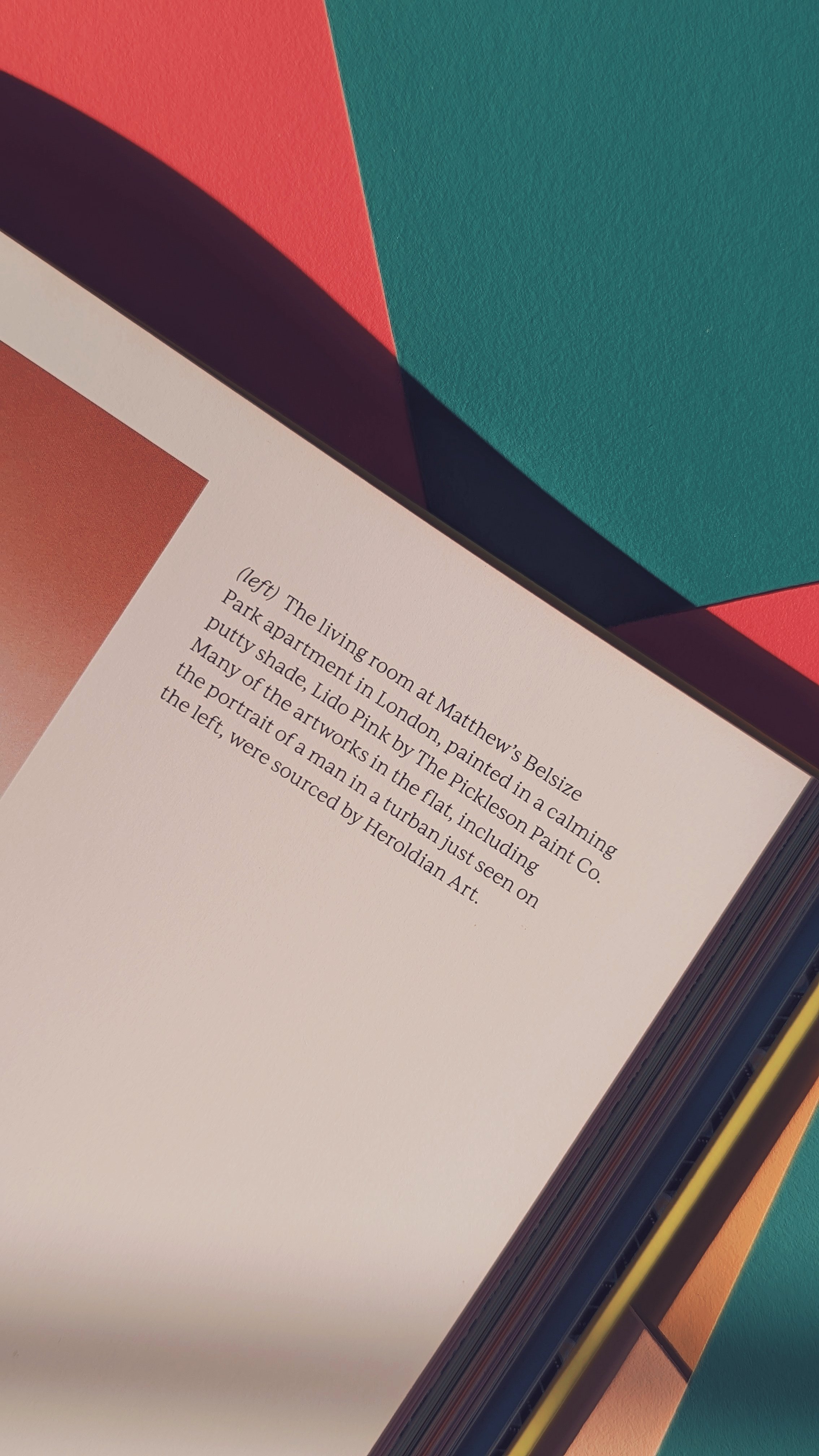
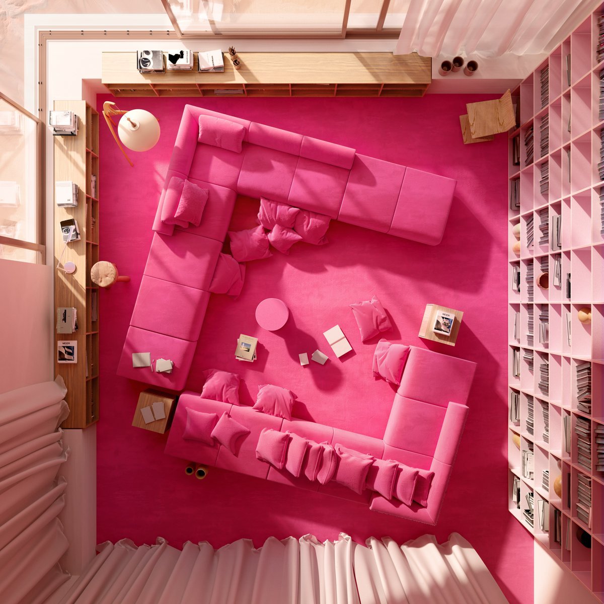
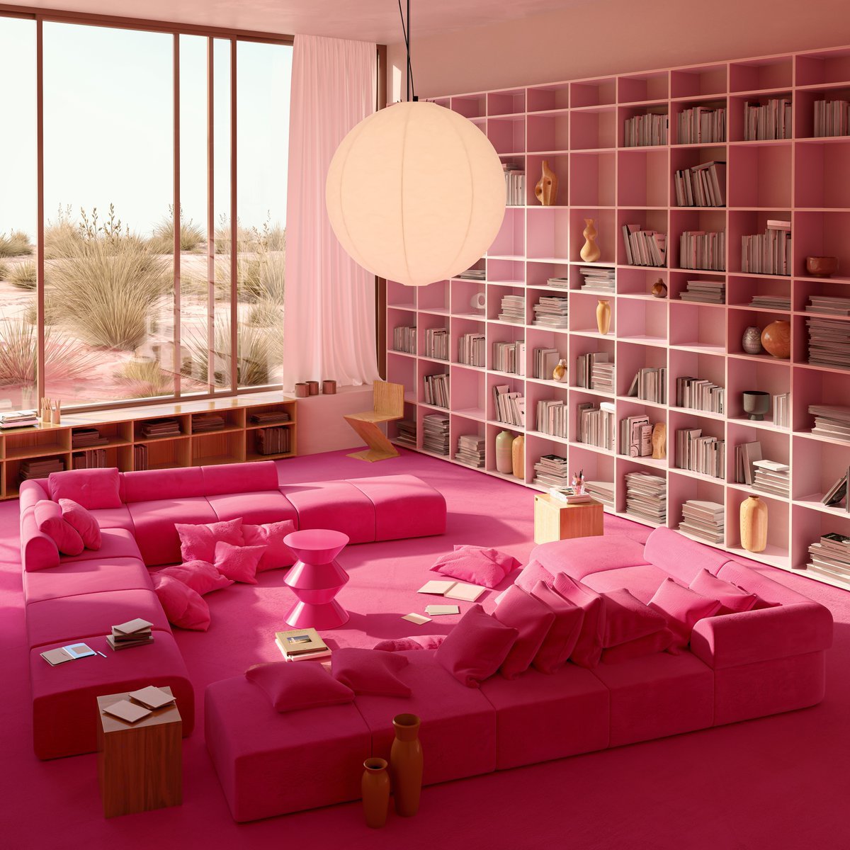
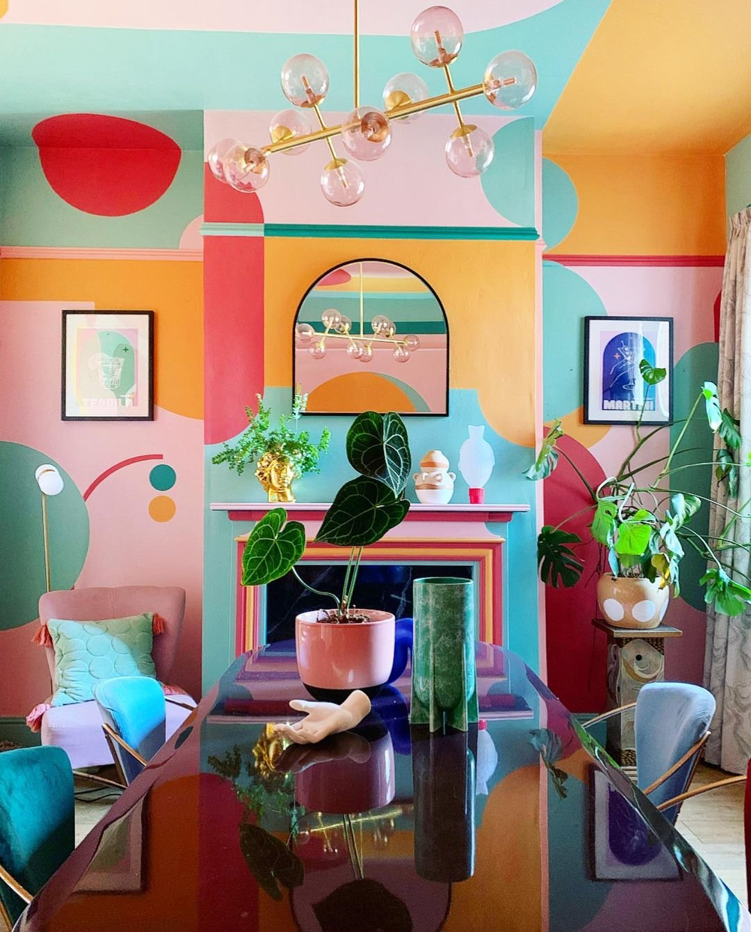
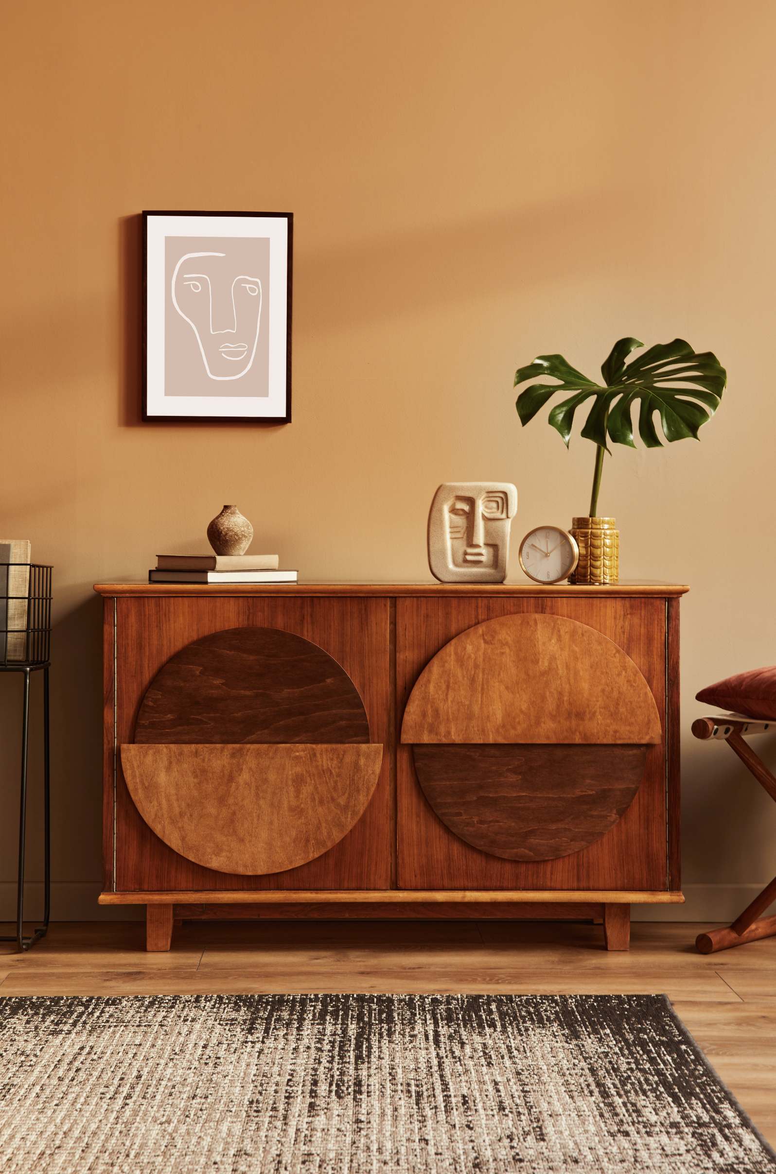
We’ve been excited to get our hands on this journey through Matthew’s life and career - told through the lens of colour - for some time now. Especially since we discovered that an image of our very own Lido Pink, splashed all over the walls of his London living-room had been chosen as the cover girl.

I think it’s fair to say Matthew has done alright for himself… He’s wowed crowds on the world’s runways, made friends with the very sexiest people on the planet, packed it all in to become a wildly successful interior designer and stylist, won accolades, written books, travelled the world, fallen in love, moved to Mallorca, started a beautiful little family and - by the looks of it - has made it to his fifties without even a whiff of a beer belly.

Ordinarily, this would be more than enough success to make one gip and - by proxy - hate him. Instead, his infectious love of design and distinct lack of pretension has seen him trot ever closer towards ‘National Tresh’ terriroty, whilst providing inspiration to the poeple of our dreary little island on how to you use pattern and colour unapologetically and - most importantly - joyfully.

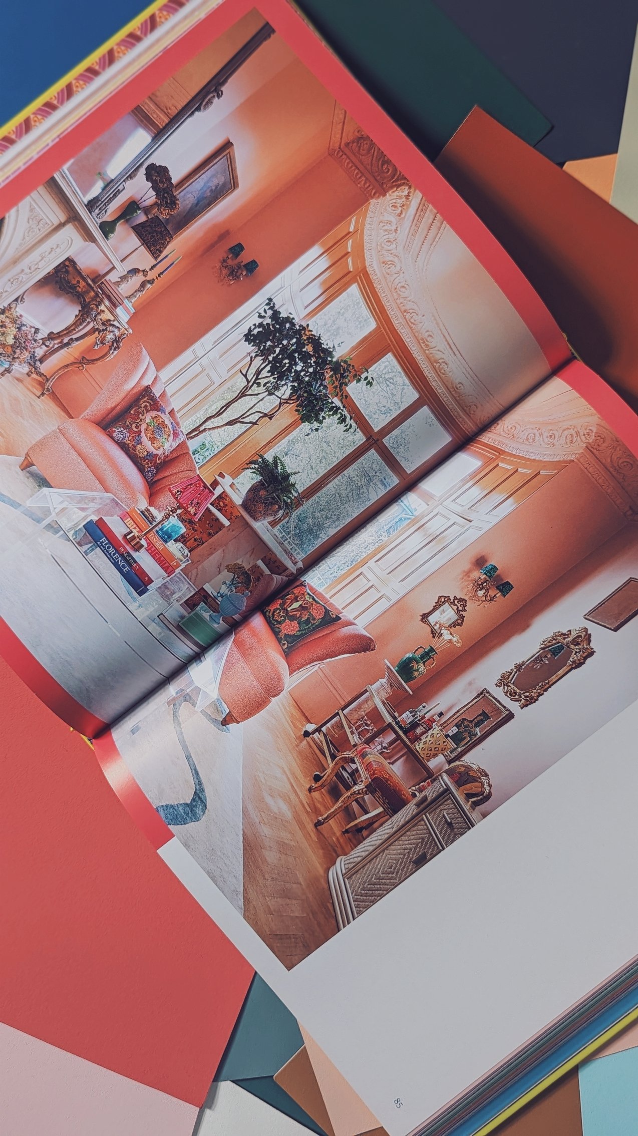
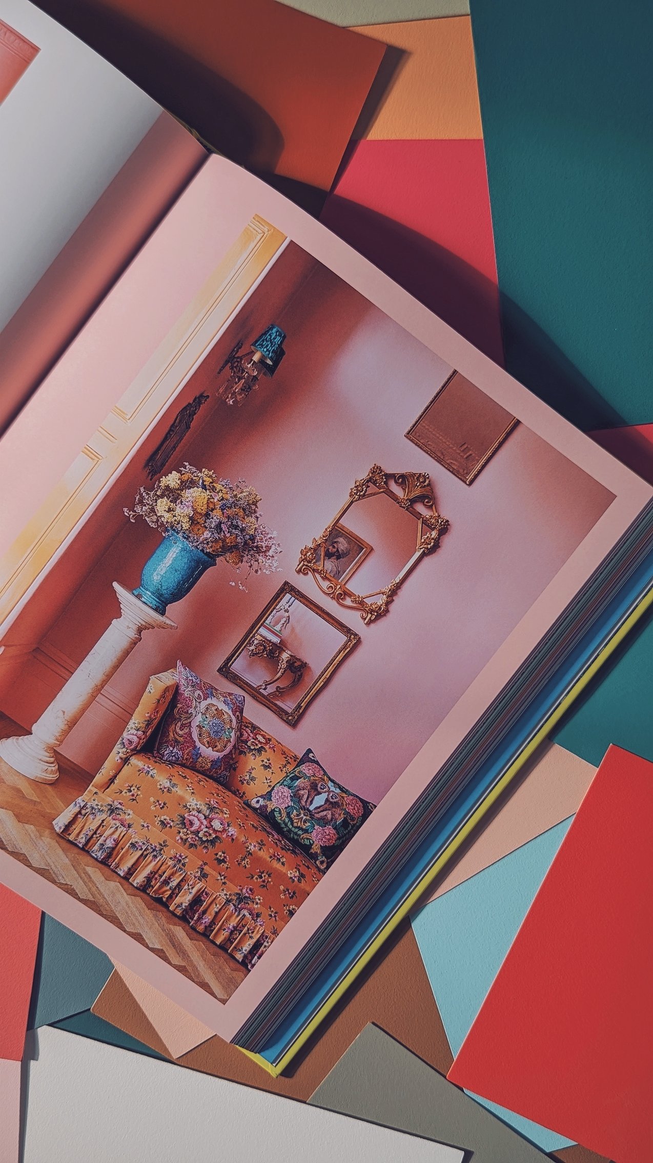
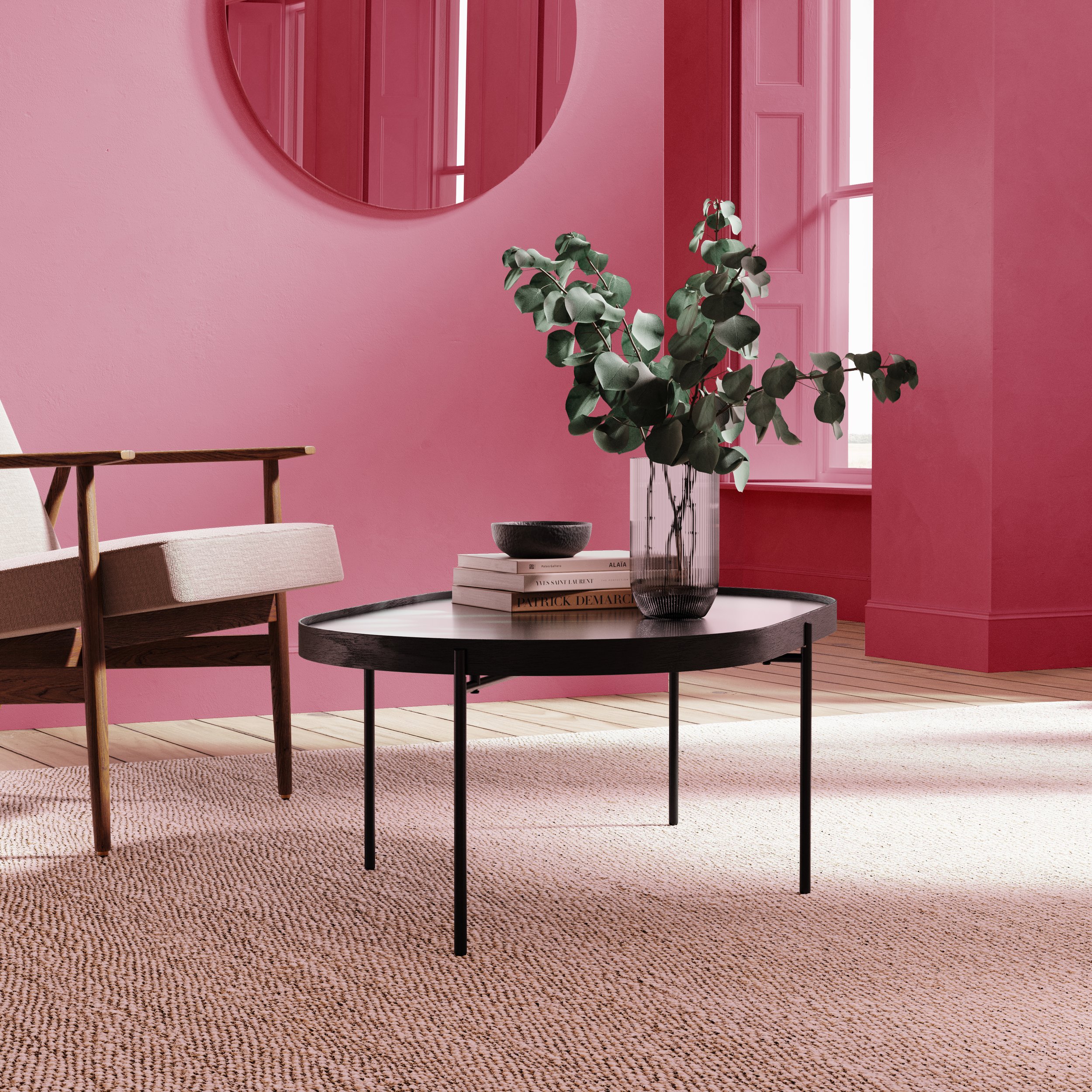
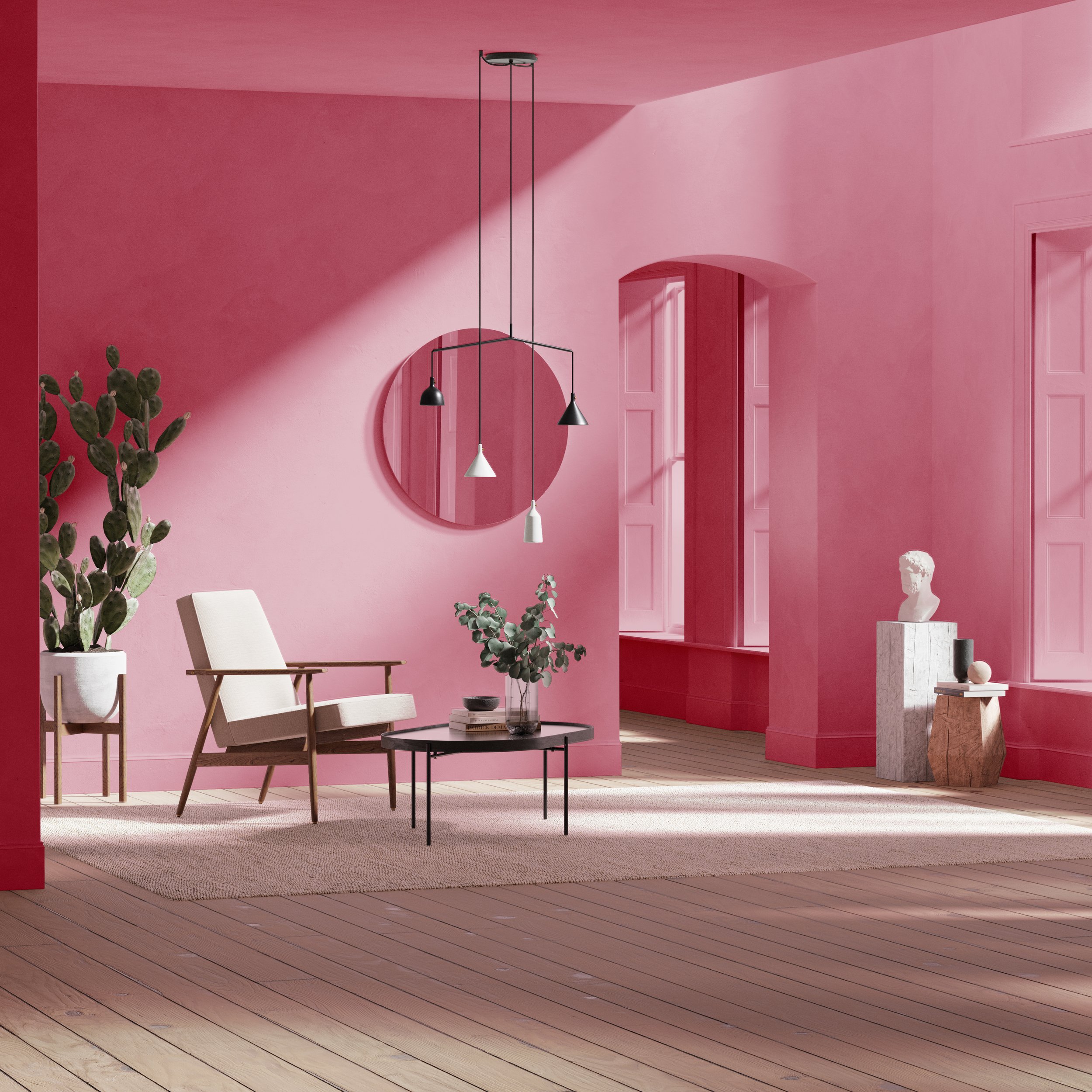
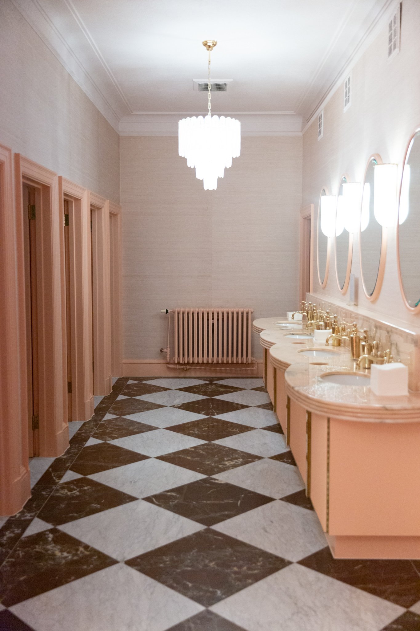
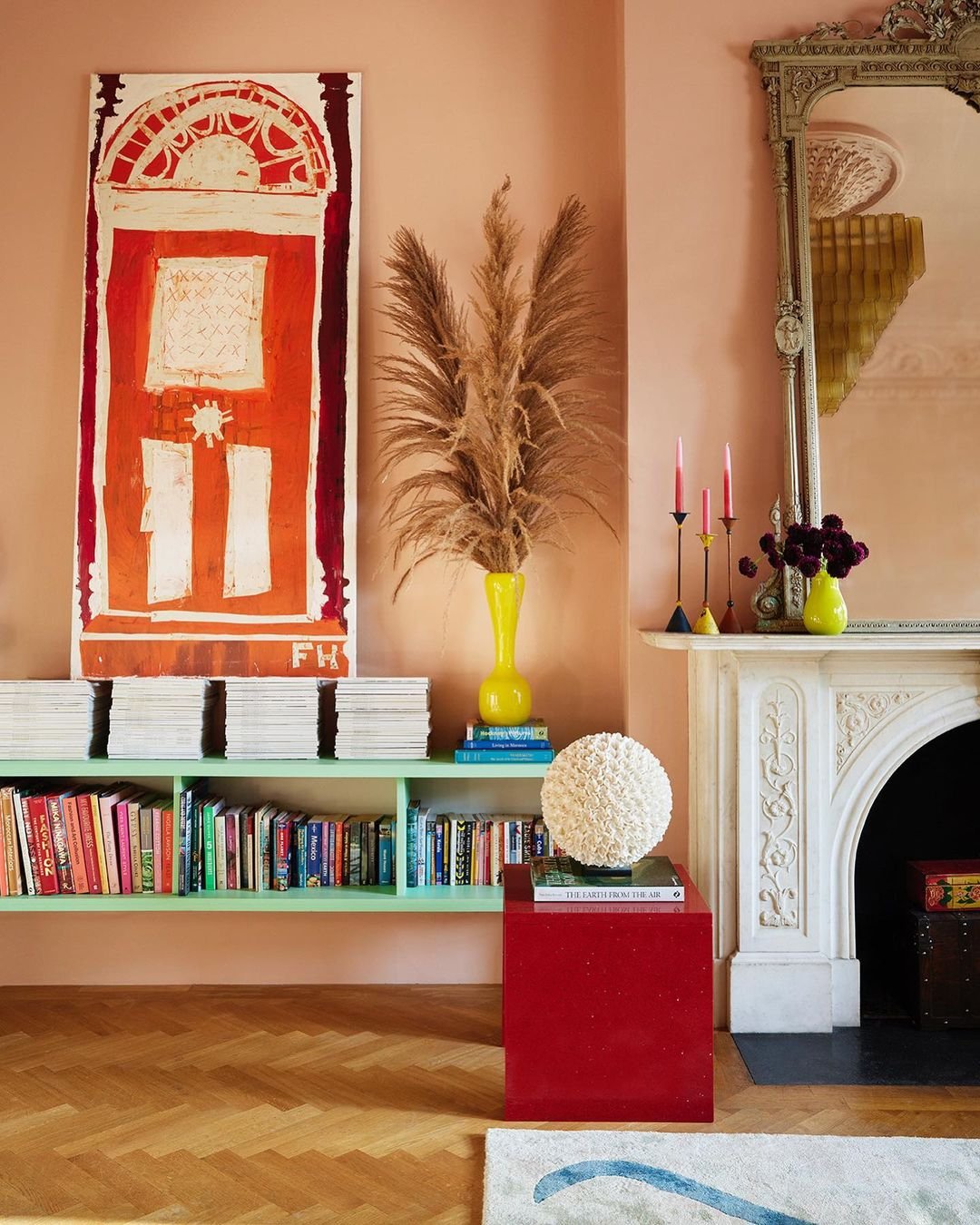
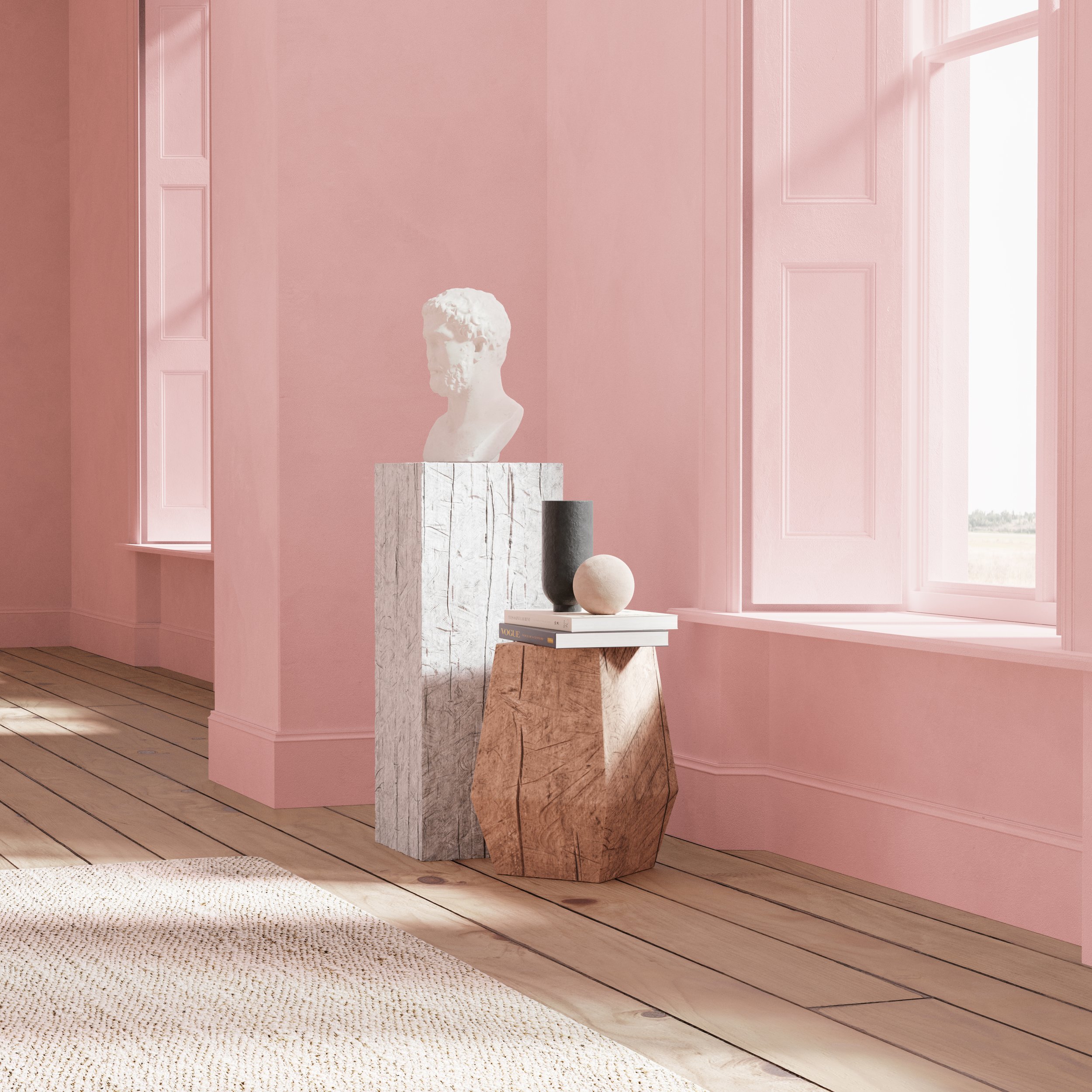
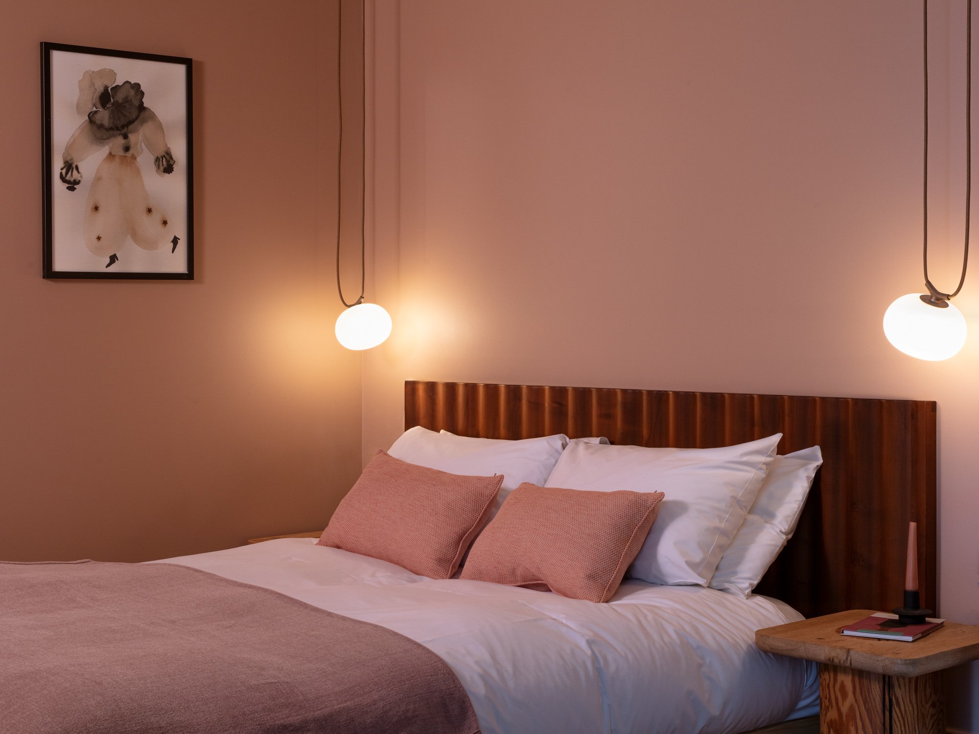
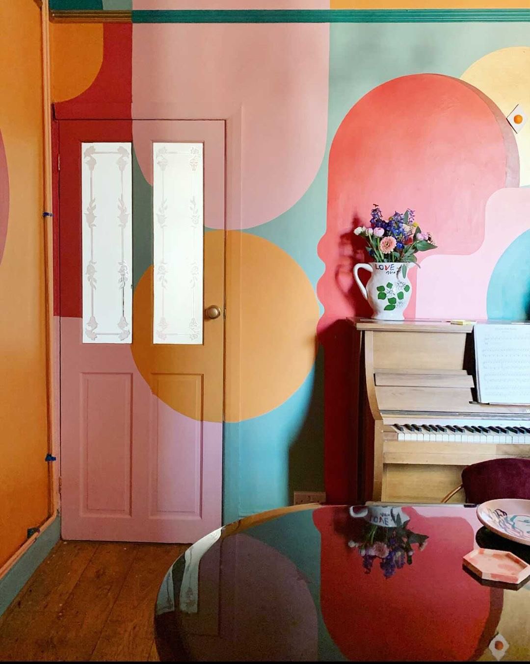
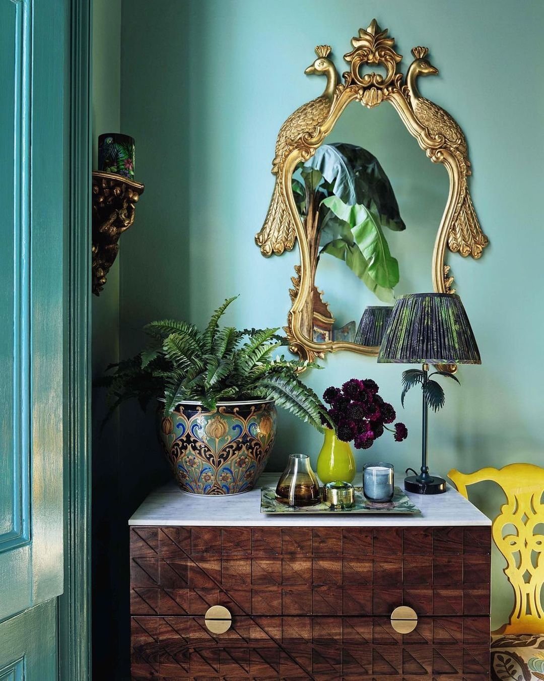
Paint: Lido Pink & Hackney Gold by The Pickleson Paint Co. | Photography : Damian Russell

Our personal love affair with Matthew started in 2022 when, much to our amazement, he posted an image of his London flat, walls adorned in Lido Pink and bay windows plastered head-to-toe in Hackney Gold.

“FUUUUUCK OFFFFF” were the exact words chosen by my sister Holly (affectionately known as Stinky) when we first told her that her great style icon had used Pickleson to paint his palace, which we think is fair enough.

At the time, Pickleson had been going for a year or so and despite some nice online comments, a bit of free press here and there and orders trickling through, we had seen nothing quite like the interest generated by Matthew’s makeover. Lido Pink instantly became our poster child, we started to be asked things like “what colours are going to be big this summer” by national publications and Rachael’s Dad (who hand-paints all of our Sample Cards) had to work over a weekend to keep up with demand.

Since then, Matthew has been consistently kind to us; featuring our colours in his projects, crediting our colours us in interviews and - most recently - dropping us a couple of his mentions in his beautifully written and very handsome new book.

A cliche it may be, but starting a business ain’t easy! It’s difficult to get going when not backed by billionaires and it’s exceedingly difficult to be taken seriously when you have pink tins and write Instagram captions that generally consist of 70s-style innuendos. So then, it truly is a blessing when someone of Matthew’s pedigree and popularity decides to take a punt on you and inspires others to do the same.

So here’s to Matthew, here’s to colour, and here’s to Living Bright.

Thanks, pal x


YOU CAN BUY MATTHEW’S NEW BOOK

‘LIVING BRIGHT’ BELOW…

Alex Kirby
The Barbie Edit

SPOILER ALERT: IT’S ALL PINK.

Pickleson founders Alex and Rachael in their home. (Not really. it’s Ryan Gosling and Margot Robbie).


FEMINIST MASTERPIECE OR CONSUMERIST MUCK?


Who knows!? Not us. It’s Friday afternoon and we’re struggling to care.

What we do know is that Greta Gerwig’s somehow 'controversial’ new Barbie Movie features a huge amount of pink. And we don’t mind a bit of pink… Pink is the colour of our tins, our hearts, and roughly a quarter of our entire paint range - which thinking about it - seems a little excessive.

Since launching in 2020, we’ve been anything but shy about encouraging you to topple the patriarchy be bold with your choice of colours, and we’re hopeful the sets of this mad little film will further inspire you to free yourself from the shackles of ‘greige‘ (whatever the fuck that is) and get right stuck in to some pink!

Below you’ll find our ‘Pink Edit’. A guide, if you will, on how to use pink in in your very own Mojo Dojo Casa House; from full-scale cardiac inducing onslaughts, to delicately creating light, elegant spaces.

Kenjoy!

Diving in at the deep end we have: Disco Pink.

Look, it’s really pink. But you already knew that… If you’re even considering using Disco Pink, you know the drill. You’re brave, you’re a great shag and everyone wanted to be you at school.

This shade isn’t for everyone’s walls, but that’s what makes it disco!

This little dreamland comes courtesy of Alba de la Fuente’s brain, with the help of Olga Roth, created for Tylko.

Pair Disco Pink with Casa Blanco for a crisp look, use alongside softer shades like Fresco or Sangria Pink or go full on Studio 54 with Drunk Tahini, Filthy Terracotta and Tarte Tan for company.


Turns out, we’re not the only one’s with fantastic taste. Some of our favourite places to visit have used pink - in various degrees - to create spaces fit for any Barbie (or Ken - we’re not ageist)…

The Gallery at Sketch London before they decided to make it look like Matthew Williams’ living room.

From left to right, Gleneagles providing a luscious blush in arguably the world’s most photographable Powder Room. Gloria using lovely, subtle notes in Shoredicth’s answer to Capri (the bathroom downstairs is also well worth a look) and Brixton’s Le Bab, where you can indulge in a naughty shawarma without ever getting cellulite, allegedly.

Disco Pink kitchen, anyone? Conversation Pit? Threesome?


Now, one Ken who know’s his pinks is television’s Matthew Williamson.

He - in his infinite wisdom - decided to paint his entire living room (ceiling an’ all) in Pickleson’s very own Lido Pink.

Sometimes almost a neutral, sometimes the star of the show! This colour really transforms with the light it's touched by and the colours with which it keeps company. Take a leaf from Matthew’s book*, get some on your walls, take a seat and watch it roll with the seasons.

*Matthew Williamson does actually have a new book in which Lido Pink is the cover girl. You can pre-order now via this link.

Paint: Lido Pink by The Pickleson Paint Co. | Photograhy: Damian Russell. | Styling: Matthew Williamson.

Matthew ‘I'd like to see what kind of nude blob he's packing under his jeans‘ Williamson in his beautiful London home.

Pair Lido Pink with Porto Cream or Just White to keep things sweet, combine with Drunk Tahini and Tarte Tan for a beautifully mellow combination or go punchy like Matthew and sling it next to Hackney Gold.


Ladies and Gentlemen, please allow us to leave the world of Barbie behind for a moment as we pop over to the equally unusual but no less beautiful world of Wes Anderson…

Budapest Pink was born out of our love of all things Wes. His sets have inspired more than one of our colours, so if you detest some of our punchier combinations, blame him. However, for those of you on the right side of history, forget all white everything! Paint your house bright pink! Viva la Couleur!

Get your hands off my Lobby Boy!

Once described as Wes Anderson’s wet dream (by us), this love letter to all things Wessy can provide fabulous results when paired with Jalapeño Red, muted by Fresco Pink and Sexy Marsala or contrasted with Jurassic Black or Veneto Verde.


We get it, you love pink but your Ken is kicking up a fuss about “not wanting pink walls”. Firstly, leave him! But alternatively, have you considered not using pink paint at all?

Here, Le Nozze Stone is used on the walls, ceilings and window frames, creating a soothing, elegant and neutral space that even the suits at Mattel couldn’t argue with. Instead, life is bought to the space with Jan Hendzel Stuio’s Mowlavi Sofa and Armchair in Soft Pink.

Paint: Le Nozze Stone by The Pickleson Paint Co. | Furniture: Jan Hendzel Studio. | Prints: Hand and Eye Studio. | Rug: A Rum Fellow. | Ceramics: Fariceramics. | Lamp: Lights & Lamps. | Photograhy: Fergus Coyle. | Styling: Amelia Annfield & Roshani Patel.

East End Clay providing a warm, almost backdrop to Jan Hendzel’s bedroom design at Town Hall Hotel.


So far, we’ve managed to successfully show you how pink has been used by some of the UK’s finest establishments, world-famous fashion designers and Wes Anderson. But what about if you’re not Wes Anderson and you live in a flat in Glasgow… or two-up-two-down Birmingham? Well, let us be the first to tell you, that hasn’t stopped this lot! And nor should it stop you!

Below are some shots of our pinks used to great effect in the homes of our customers. Our top-notch, visionary, one-of-a-kind, don’t take shit from nobody customers…

Paint: Pickle Blue, Budapest Pink, Fresco Pink, Lido Pink and Sangria Pink by The Pickleson Paint Co. | Styling and Photography: Caitlin Miller.

The wonderfully bonkers home of Richard O’Gorman a.k.a House Homo.

Paint: Budapest Pink, Fresco Pink and Jalapeño Red by The Pickleson Paint Co. | Design: Evoque Lab.

So there you have it - a bit of an ode to a colour that brings us joy and might just be more usable than you think.

Whether you’re Guns Blazing Barbie, Open To Experiment Barbie or Neutrals Barbie, there’s a shade of pink to make your Barbie Dream House your own.

Bye Barbie!

Alex Kirby
Introducing…Cheeky Tan.

For Patchos.

Paint: Cheeky Tan by The Pickleson Paint Co. | Model: Patchos.

Updated 20th June 2023: This feature has been revised to include new developments in regards to the discovery of Patchos’ siblings.


Chania, Crete…

…Is where we first locked eyes on our good-time boy from Greece.

It was a rainy day in paradise. The mist had descended on The White Mountains, spending the day sunning ourselves was out the window and it was far too early to start day drinking in earnest. So we jumped into the deeply questionable 90’s Jimny we’d hired for the trip, rolled-up the canvas roof and headed to The Souda Shelter; an under-funded but absolutely vital Dog Shelter, run by Elizabeth Iliakis and a team compiling mostly of volunteers, who provide a safe place for abandoned, abused and stray dogs. They provide animals with food, shelter, healthcare and compassion, before helping to find them a forever home. Not an easy place to find though, it turns out! A few wrong turns, a touch of mild panic and the odd near death experience saw us - eventually - creep under a subway, beneath one of Crete’s busiest roads and out the other side, to pull up alongside a wire-fenced fortress, guarded by what sounded like a thousand hounds. The smell of wet dog thick in the air.


Undeterred, we waited at the gates to be let in by one of Souda’s volunteers. She waded through a full squad of mutts to reach the first of two gates, opened it and passed through to get closer to where we were stood. An enthusiastic four-legged lad had wriggled through with her undetected, so she turned around and re-opened the first gate to let him back into the shelter proper. Only this time two escaped. Then three... This went on for some time.

Once inside, we were greeted by a rag-tag bunch of beautiful boys and girls. Instantly affectionate, curious, windswept and interesting types with kind eyes and cheeky grins. We were licked half to death as we roamed around the various enclosures meeting certified good boy after certified good boy. They came in all different shapes and sizes… Some big, some small, some short, some seemingly terrifying; but all of them absolutely charming. We met Shane (short-stuff and leader of the welcome committee), we met Toby (world’s most handsome man), we met Phil (a bonafide old-school eccentric with a heart of gold) and we met Flint - who despite having a badly broken leg and a tough, tough life - was beside himself with excitement at the very idea that someone would want to stroke his little head. We had already fallen in love thirty-seven times at this point. But then, in the very far corner of the shelter, in a pen within a pen, sat Patchos.

Patchos in his pen at The Souda Shelter.

Looking like a Wes Anderson stop-motion character.

From left to right, Shane, Toby, Flint and Phil.

Both Shane and Flint are still at The Souda Shelter,

looking for their forever homes.


I should probably admit at this stage that this wasn’t exactly a chance meeting. A couple of weeks prior to our visit, I had scanned the shelter’s website, seen some pictures of Patchos, cried, then rather dramatically announced to a room filled with only Rachael that “HE IS MY DOG”. As dramatic as I may have been, I wasn’t wrong. Rachael and I let ourselves into his little home and instantly fell in love. He was perfect. And he was going to be our best friend.

Woof!

Rachael and Patchos meet for the first time at The Souda Shelter.


Skip forward a couple of weeks to 3.30am on a rainy night in East London and the arrival of Patchos. His journey had taken him from Crete to Athens by boat, from Athens to Paris by plane and from Paris to London by car. It was a long and no doubt traumatic journey for what was already a very scared little dog. Though expertly arranged and actioned by Elizabeth and her team of volunteers, he was exhausted and silent. He did however recognise our faces. He gave us a lick, had a big drink, pissed on the floor and fell asleep in our arms.

Our little Cretan on his first morning in London.


Six months have now passed and Patchos is happy, healthy and enjoying his new life with us in the UK (with the exception of the weather and the fact he’s struggling for a decent Gyros). He’s affectionate, funny, remarkably clever and an absolute chancer! Coming in at 1ft nothing and just a little bit long, our tiny Greek hound is the direct inspiration for our latest shade, Cheeky Tan. We say direct, because this colour is a literal match of his tiny golden cheeks…

Introducing… Cheeky Tan.

We can vouch for the colour match. When we were painting the samples for this new colour of ours, he wagged his tail all over the wet paint.

We’re yet to figure out whats paint and whats Patchos.


Cheeky Tan has all the warmth of a Cretan sunset, the dustiness of an ancient relic made perfect by time, and immediately makes us crave a slab of Moussaka and an ice-cold Mythos. It’s sometimes a light sandy brown, sometimes yellow and - much like Patchos - always, always handsome… Unless its asleep with its mouth open.

We have fallen in love with Chania, and Crete, and Greece in general. It’s an achingly beautiful part of the world; full of handsome, kind, generous people who appear to have a natural instinct for shaping life’s most natural wonders into things of effortless beauty. It does however, have a heartbreaking and systemic problem with abandoned, abused and stray animals. Elizabeth and her team at Souda Shelter do remarkable work in alleviating the problem in and around Chania, but they receive no official funding and are perpetually over-capacity. Almost daily, animals are dropped at the gates of the shelter after being abandoned, injured or found in rubbish bins. They simply cannot take-on any more dogs, but they always do.

Fundamentally, Souda’s mission is to find permanent homes for the animals they care for, but we have experienced first-hand the dedication and professionalism they show in making sure each and every dog that enters their shelter is given vital healthcare, food, safety and love. In Patchos’ case, they took care of his jabs, medicines, passport application and organised his safe passage to our door in East London. They are brilliant at what they do and need all the support they can get.

With every order of Cheeky Tan, we’ll be donating £10 to the Souda Shelter Project. Here’s hoping we can help more little Greek rascals find safe and loving homes full of colour, and laughter, and hope.

To find out more about The Souda Shelter, Make A Donation or find out more about Adopting a Dog of your own, visit their website.


Here are some of The Souda Shelter’s current guests, all in need of a home…


Update:

Since the original writing of this feature… It seems we have - completely by chance - discovered Patchos’ siblings, from a new litter.

Mira, Jossi, JumJum and Mio (who is currently suffering with an injured leg) were found in a remote village in the mountains outside Kissamos by Julia Karlsson and her family whilst on holiday in the area. They fed and watered the pups and built them a temporary shelter before seeking the help of Animal Friends of Kissamos, who have since provided the dogs with temporary foster and health care.

They are all in desperate need of permanent homes, so if you’re interested in adopting one (or of course all) of Patchos’ siblings, do get in touch via hello@picklesonpaint.com and we’d be delighted to help you with the process. In the meantime, you can donate directly to the shelter looking after them, and many other wonderful dogs, via the link below…

From left to right - Mira, Jossi, Mio and JumJum.

Alex Kirby
Jan Hendzel Studio x Town Hall Hotel

Paint: Le Nozze Stone by The Pickleson Paint Co. | Furniture: Jan Hendzel Studio. | Prints: Hand and Eye Studio. | Rug: A Rum Fellow. | Ceramics: Fariceramics. | Lamp: Lights & Lamps. | Photograhy: Fergus Coyle. | Styling: Amelia Annfield & Roshani Patel.

In the heart of Bethnal Green…

…Just a thirty second walk away from Pickleson HQ (that’s our flat, if you’re interested) sits Town Hall Hotel. A former municipal building - turned boutique hotel - that has been around long enough to see its fair share of changes. Enveloped in Portland Stone, this place has been stubborn enough to survive wars and flexible enough to adapt to its constantly changing surroundings for over a century, without losing an ounce of its dignity or style.

Its latest reinvention comes in the form of a transformative double apartment suite design, led by the wildly talented bunch at Jan Hendzel Studio, in collaboration with London Design Festival. Creating pieces full of texture and sculptural finesse are what Jan has become best known for over the years, and his design for this East End stalwart is no exception. The refurbished rooms are now flush with Brown Oak, English Ash and London Plane, all having been manipulated - by hand - into something extraordinary. You will find smooth curved edges on coffee tables, ageing cracks in young green wooden sculptures and hand-carved grooves on mounted mirrors… It’s all quite sexual if you ask me.

The back drop to all of this? Well, it’s Pickleson, naturally. We’ve had the pleasure of not only lending a hand on this project with colour consultation and design, but have also worked with Jan and his team to come up with a bespoke new colour to adorn the walls. Introducing, East End Clay…

East End Clay offers a light - almost blushing - tan that looks just at home in Umbria as it does in the East End.

Here, it snuggly envelops Jan’s Bowater Headboard and provides a sanctuary for what is otherwise an open bedroom. A little scrap of calm in an otherwise chaotic segment of the East End.

Like the corner of our capital it was created in (and for), East End Clay has a miraculous ability to adapt to its surroundings; transforming itself to harmonise with changes of colour, light and style. It’s bold but grounded, modern but historic, and slightly dirty… but a lot of fun!

The remainder of the spaces have also had the full Pickleson treatment, with Le Nozze Stone being used in the living spaces, Tarte Tan gracing the doors and Veneto Verde adorning the walls of the second bedroom.

You’ll find Drunk Tahini in one bathroom, Europa Green in another and touches of Pickle Blue and Sunday Brown worked into sculptural surprises, the paint having been watered down, so the grain of the wood is still visible.

The palette used in these suites are a lesson in understated colour blocking. Each section of each suite is clearly defined by a new shade - yet seamlessly married together, drawing your eye from corner to corner as you walk through the space. It’s just distracting enough to make you forget you’re in Bethnal Green, but not so much that you’ll stub your toe on Jan’s immaculate coffee table. If you’re working with an open-plan space but don’t want it to look like Craig David’s shag palace, this is the palette for you!

The East End means a lot to us, it's where we call home. So the opportunity to create a new shade for such a stoic building - that sits literally seconds away from our front door - has been a real treat.

East End Clay, is now available for you slaaaags to purchase. We hope you love it as much as we do.


To learn more about this project, check out some of the articles below…

Alex KirbyComment